About the Favicon
or, Visualizing a Hilbert Curve in Python
- The Hilbert Curve
- Edge Enhancement
- Rounding Corners
- Resharpening
- Padding
- Creating Image Files
- Acknowledgements
- Metadata
If you’ve spent some time on my website…firstly, thank you! Secondly, you may have noticed a colorful little square icon in the browser tab, also known as the site favicon. When I first started this site, I was missing an icon, so naturally I set about making one for myself. What then began as some throwaway code to generate a tiny image soon became its own project and ultimately turned into something cooler than I originally expected, so I’m going to explain what it is and how I made it.
The Hilbert Curve
It’s a Hilbert curve.
Since my website has a lot of fractal-related content, it made sense to use a fractal as its symbol. As far as fractals go, the Hilbert curve is a true classic, dating back to 1891 when it was first discovered by the legendary mathematician David Hilbert. It belongs to a class of fractals called space-filling curves. Nowadays we know of countless examples of space-filling curves, but Hilbert’s is still remarkable in its simplicity. It can be defined as the unique continuous function satisfying the functional equation
It’s not too hard to show that these equations define a unique continuous function , and that this is actually surjective, i.e., maps onto the whole unit square! A two dimensional shape as the image of a one-dimensional interval under a continuous function, isn’t that pretty amazing? I’ll skip the proof here because it’s too much of a digression, but like I said it isn’t too difficult if you’re interested in trying to fill in the details, with a little bit of real analysis.
So here’s the game plan for the visualization: first we’ll pick a nice colormap for the input interval , and then we’ll apply this function to transfer the colors onto the square. Here’s the mathematical representation of that:
where is the per-pixel color we’re trying to compute on the unit square, and is our chosen colormap for the unit interval. There’s a slight complication here because isn’t one-to-one, so isn’t technically well defined. However, this is no big deal in practice because has a sequence of discrete approximations that are fully bijective, and we get them simply by iterating the functional equation a finite number of times and discretizing both sides to appropriate powers of two.
For the colormap, right now we mainly just want something that’s dynamic and perceptually uniform, but later on we’ll also want it to avoid becoming overly dark. It seems quite difficult to achieve all of those and still maintain some semblance of aesthetics, but Matplotlib’s plasma does it pretty well in my opinion, so that’s what we’ll use.
As we get started with code, if you want to follow along with this Python implementation, we need to get a couple things sorted first. First, you’ll need these dependencies:
pip install numpy scipy matplotlib pillow
Second, you’ll need a way to visualize raw RGB image data. I suggest using a Jupyter notebook, which is how I made everything you see here. In that case we can do it conveniently like this:
import io
import IPython.display

def show(rgba):
    stream = io.BytesIO()
    plt.imsave(stream, rgba, origin='lower', format='png')
    display(IPython.display.Image(stream.getvalue()))
(matplotlib.pyplot.imshow also works, but keep in mind that it likes to resize images, which can be misleading.)
With that out of the way, here’s the implementation of all of that math:
import matplotlib.pyplot as plt
import numpy as np
def compute_hilbert(bits):
v = np.array([[0.5]])
for _ in range(bits):
v = np.block([[v.T, v.T[::-1, ::-1] + 3], [v + 1, v + 2]])/4
return v
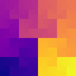
hilbert_values = compute_hilbert(bits=8)
cmap = plt.get_cmap('plasma')
hilbert_rgba = cmap(hilbert_values)
show(hilbert_rgba)
That’s it! We can stop here, and just for the tiny website icon, there’s arguably no reason to keep working on it. However, we’ll take it a little bit further because there’s more to life and math than favicons, and there’s something a little bit unsatisfying about what we’ve created here. In my opinion some of the most interesting fractal structure is difficult to see in this visualization, so we’re going to look for a way to see it better.
But before making things more complicated, let’s briefly pause and simplify. By looking at the hilbert_values data in its raw form, maybe we can build some intuition for how this thing behaves. By construction, the array hilbert_values has values in the interval , but we’ll be renormalizing the values, and the reason for that should be clear momentarily. We’ll also decrease the number of iterations so we can comfortably look at all of the values.
bits = 3
data = compute_hilbert(bits) * 2**(2*bits) - 0.5
print(data[::-1])  # reverse the rows to align with the image
[[21. 22. 25. 26. 37. 38. 41. 42.]
 [20. 23. 24. 27. 36. 39. 40. 43.]
 [19. 18. 29. 28. 35. 34. 45. 44.]
 [16. 17. 30. 31. 32. 33. 46. 47.]
 [15. 12. 11. 10. 53. 52. 51. 48.]
 [14. 13.  8.  9. 54. 55. 50. 49.]
 [ 1.  2.  7.  6. 57. 56. 61. 62.]
 [ 0.  3.  4.  5. 58. 59. 60. 63.]]
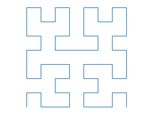
Starting with 0 in the bottom left corner, we have all the whole numbers up to 63, and we can always get from one number to the next by going one step up, down, left, or right. So it really is a single continuous path that seems to fill up a whole square, hence the term “space-filling.” With the help of Matplotlib, we can trace it out:
def plot_path(bits):
    hilbert_values = compute_hilbert(bits)
    idx = np.argsort(hilbert_values, axis=None)
    y, x = np.unravel_index(idx, hilbert_values.shape)
    plt.plot(x, y)
    plt.axis('equal')
    plt.axis('off')

plot_path(bits=3)
plt.show()

And if we do one more iteration, we can see more of the recursive fractal structure emerge:
plot_path(bits=4)
plt.show()
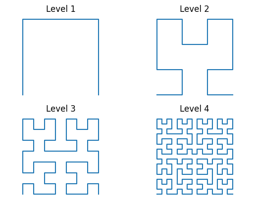
To make this even clearer, we can put levels 1-4 next to each other to help up see how each subsequent iteration level connects together four small copies of the previous level.
for bits in range(1, 5):
    plt.subplot(2, 2, bits)
    plot_path(bits)
    plt.title(f"Level {bits}")
plt.show()
To see this same type of structure in the original plasma-colormapped image, we need to start at the darkest color in the lower left corner and try to trace out a path that makes the colors change as continuously as possible while traversing over the whole square. Let’s repeat the original image here for easy reference:
show(hilbert_rgba)

On my computer monitor, my eyes can maybe discern detail up to about level four here, or even just three to be conservative. That’s a shame because the image uses eight iterations and thus technically should have much finer detail than that. However, we’re up against some pretty fundamental limitations. First, we have challenges of human perception. If we want to be able to see a continuous path through the colors, we should be able to see all the color discontinuities, but the smaller discontinuities have really small color jumps, and those are just hard to see. Second, there’s a fundamental computational limitation, because our color depth is finite. Twenty-four-bit color literally doesn’t have enough precision to represent our plasma-colormapped image in such a way that all the color discontinuities appear at exactly the right places at the high levels of detail that we’re demanding.
Therefore, while I think the color mapping idea clearly has some value, it looks like it’s going to need some help if we really want to see a detailed Hilbert curve. That’s what we’ll explore next.
Edge Enhancement
We can try to get a better look at the fractal structure by enhancing color discontinuities. Here’s the motivation: the color changes abruptly across certain horizontal and vertical lines. Those discontinuity lines happen to be exactly the “negative space” of the Hilbert curve, and we can treat them as such by darkening them, for example. Then maybe the curve itself will be easier to make out visually as the remaining positive space.
We’ll do this by applying a discrete Laplacian operator, which finds pixels whose values differ significantly from averages over small neighborhoods. That will give each pixel a “score” of how important of an edge discontinuity it appears to be on, and we can then use those scores to darken the corresponding pixels, i.e., shunt them into the visual background.
from scipy.signal import convolve

def edge_filter(n):
    """
    Return a simple edge detection filter. The result will be square
    with 2*n + 1 elements on each side.
    """
    # I didn't think too hard about these coefficients. In practice we
    # use a tiny neighborhood size anyway, so it doesn't matter too
    # much.
    x = np.r_[-n:n+1]
    coefficients = np.maximum(0, n + 1 - np.hypot(x, x[:, None]))
    coefficients /= -coefficients.sum()
    coefficients[n, n] += 1
    return coefficients

# SciPy implicitly zero-pads our data inside `convolve`, so if we
# temporarily shift all the values by some big number (4), the
# boundary of the image will be detected as edges. This is consistent
# with the positive/negative space idea.
edges = convolve(hilbert_values + 4, edge_filter(1), mode='same')
mask = -np.log(np.abs(edges))
mask -= mask[mask.shape[0]//2, mask.shape[1]//2]
mask /= np.quantile(mask, 0.75)

mask = np.clip(mask, 0, 1)
Now we have a mask we can multiply over the image to darken the places where the color changes abruptly. We applied a log-scale transformation to further enhance the smallest details, and we also normalized the mask values so that:
- the obvious discontinuity right in the middle gets the maximum penalty, and
- the smoothest 25% of pixels are deemed pure foreground and won’t be darkened at all.
Here’s the result.
# hilbert_rgba[..., 3] is the alpha channel, and we don't want to touch
# that just yet.
hilbert_rgba[..., :3] *= mask[..., None]
show(hilbert_rgba)
Now there’s much more structure, but it’s got the opposite problem: there’s so much detail that it’s hard for the eye to follow. We’ll try to address that next.
Rounding Corners
It would be easier to see the path of the space-filling curve across the square if we could see where it was turning right and left, right? To do that, we’ll need to sacrifice some of the finest details in the masked image, but hopefully it’ll be worth the trade. We’ll do it by applying a corner-rounding morphology operation. The technical name for it is opening, but I’ll call it something else because in my opinion the terms opening and closing from morphology are not intuitive at all. So I’ll call it “maxmin” because it has the form . To make the effect less abrupt, we’ll apply several different corner radii and average over all the results.
from scipy.ndimage import minimum_filter, maximum_filter

def maxmin_filter(data, stencil):
    """
    Apply a minimum filter followed by a maximum filter to the input
    image.
    """
    data0 = minimum_filter(data, footprint=stencil, mode='constant')
    return maximum_filter(data0, footprint=stencil, mode='constant')

def circular_stencil(n):
    """
    Return a binary mask of shape (2*n + 1, 2*n + 1) approximating a
    filled circle.
    """
    x = np.linspace(-1, 1, 2*n+1)
    y = x[:, None]
    return x*x + y*y <= 1

def round_corners(mask, roundness):
    """
    Compute a new mask with internal corners rounded off.
    The nonnegative integer `roundness` value controls how much
    rounding is done, with 0 meaning none.
    """
    masks = [mask]
    for n in range(1, roundness + 1):
        masks.append(maxmin_filter(mask, circular_stencil(n)))
    return np.mean(masks, axis=0)

mask = round_corners(mask, roundness=5)
hilbert_rgba = cmap(hilbert_values)
hilbert_rgba[..., :3] *= mask[..., None]
show(hilbert_rgba)
It looks like we have rounder corners now, but unfortunately we also darkened the whole image, and that’s because our mask normalization is no longer correct. To fix that, let’s move some of the normalization to after the corner rounding, and let’s also add the possibility of brightening the top few percent of mask values, to partially compensate for the fact that we’re generally making everything darker.
def get_edge_mask(data, roundness):
    """
    Compute a mask to darken edge discontinuities, also rounding
    internal corners. The nonnegative integer `roundness` value
    controls how much rounding is done, with 0 meaning none.
    """
    edges = convolve(data + 4, edge_filter(1), mode='same')
    mask = -np.log(np.abs(edges))
    mask -= mask[mask.shape[0]//2, mask.shape[1]//2]
    mask[mask < 0] = 0
    mask = round_corners(mask, roundness)
    mask /= np.quantile(mask, 0.75)
    return mask

def apply_mask(rgba, mask):
    """
    Darken or lighten image values using the mask. Mask values should
    be nonnegative, with values less than 1 darkening the
    corresponding image pixels and values greater than 1 lightening
    them.
    """
    # The `+ 1.0` fudge factor prevents too much lightening.
    # We're trying to get a subtle effect.
    v1 = mask.max() + 1.0
    a = np.minimum(mask, (v1 - mask)/(v1 - 1))
    b = np.maximum(0, (mask - 1)/(v1 - 1))
    rgba = rgba.copy()
    rgba[..., :3] = rgba[..., :3]*a[..., None] + b[..., None]
    return rgba

hilbert_rgba_raw = cmap(hilbert_values)
mask = get_edge_mask(hilbert_values, roundness=5)
hilbert_rgba = apply_mask(hilbert_rgba_raw, mask)
show(hilbert_rgba)
I think that strikes a pretty good compromise. We didn’t lose too much edge detail compared to the first masking attempt, and in my opinion it’s not too hard to visually follow the curve through the colorful parts.
If it’s still hard to see the larger-scale structure, simply increasing the roundness value works pretty well, but it does increase the computation time, and we lose more detail:
mask = get_edge_mask(hilbert_values, roundness=15)
hilbert_rgba = apply_mask(hilbert_rgba_raw, mask)
show(hilbert_rgba)
I personally prefer the previous one, so we’ll go back to roundness=5 in what follows.
Resharpening
You might notice that the dark edges in the image are all two pixels wide, which seems really unnecessary in my opinion. To make these edges, we had to sacrifice some valuable plasma-color pixels, and it would be nice to have the edges be just one pixel wide so we could keep more of the colorful parts.
The edge width is a feature of the edge detection filter we applied, and it’s kind of impossible for it to do better than two pixels, since every edge will be detected from both sides. That’s fine, though: since we can choose our resolution to be any power of two, we can just render the image at double the resolution we actually want, and then shrink it by a factor of two! Then our two-pixel-wide edges should shrink down to just one pixel. However, we need to be careful here: the middle of every edge is always an even number of pixels from the image boundaries. That means if we average over two-by-two blocks to shrink the image, the edges will actually fall between the blocks and won’t be shrunk down at all! We can avoid that just by adding a one-pixel boundary to the image.
Since we’re doing most of the computation at a higher resolution now, for consistency we’ll also increase the roundness value below from 5 to 10, since roundness counts in absolute pixel units.
def shrink_image(rgba):
"""
Shrink the input image by a factor of two. This is done carefully
by first adding a one-pixel border, so that internal Hilbert curve
borders get sharpened.
"""
s0, s1 = rgba.shape[:2]
rgba_padded = np.zeros((s0 + 2, s1 + 2, 4))
rgba_padded[..., 3] = 1
rgba_padded[1:-1, 1:-1, :] = rgba
rgba = rgba_padded.reshape(s0//2 + 1, 2, s1//2 + 1, 2, 4)
return rgba.mean(axis=(1, 3))
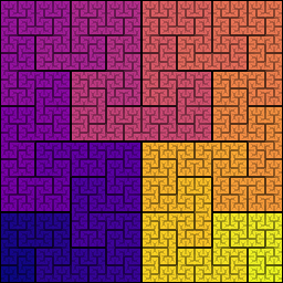
hilbert_values = compute_hilbert(bits=9)
hilbert_rgba = cmap(hilbert_values)
mask = get_edge_mask(hilbert_values, roundness=10)
hilbert_rgba = apply_mask(hilbert_rgba, mask)
hilbert_rgba = shrink_image(hilbert_rgba)
show(hilbert_rgba)
This is it, for the most part. We’ll go into some more minor technicalities below, but they won’t change this final result of the computation.
Padding
If I wanted to…I don’t know, create an avatar for my public GitHub profile, there are a few more considerations. First, the optimum size for GitHub avatars seems to be 460 pixels by 460 pixels. Second, the visible part of the avatar is, for reasons I still can’t understand, a circular region inside of the full avatar image. Third, the background the avatar is shown on doesn’t have a fixed color and depends on the viewer’s browser settings and selected theme.
The image we just created is 257 pixels by 257 pixels:
print(hilbert_rgba.shape)
(257, 257, 4)
Some quick math shows that a circle inscribed in a square of dimensions 460 pixels can contain the entire square of dimensions 257 pixels, with plenty of room to spare. Without going into a massive rant about GitHub’s avatar shape, what made sense to me was to add a dark border that fades out into transparency. We can also offset the border to make it look like a shadow, which looks kind of cool.
Here’s the code for that, and the final result.
from scipy.ndimage import distance_transform_edt

def pad_image(rgba, dim=(460, 460),
              border_size=10, border_shift=(-3, 3)):
    """
    Add a transparent border to the given image, padding it to the
    specified dimensions. The input image will be centered in the
    result.

    The image will have a black border that fades away from the image.
    A shift can also be applied to add the illusion of depth.
    """
    size0, size1 = rgba.shape[:2]
    if size0 > dim[0] or size1 > dim[1]:
        raise RuntimeError("image doesn't fit")
    off0 = (dim[0] - size0)//2
    off1 = (dim[1] - size1)//2
    rgba_padded = np.zeros((dim[0], dim[1], 4))
    rgba_padded[off0:off0 + size0, off1:off1 + size1] = rgba

    # Here's the black border and shadow. distance_transform_edt is a
    # little bit too much machinery for what we're doing here, but we
    # already have the dependency and it's a one-liner, so...
    bg = np.ones(rgba_padded.shape[:2])
    bg[off0:off0 + size0, off1:off1 + size1] = 0
    d = distance_transform_edt(bg)
    alpha = np.maximum(0, border_size - d) / border_size
    alpha = np.roll(alpha, border_shift[0], axis=0)
    alpha = np.roll(alpha, border_shift[1], axis=1)

    rgba_padded[..., 3] = np.maximum(rgba_padded[..., 3], alpha)

    return rgba_padded

hilbert_rgba_final = pad_image(hilbert_rgba)
show(hilbert_rgba_final)
Creating Image Files
Finally, we’ll want image files we can send around and upload. The Pillow package, imported below as PIL, makes this simple.
import os
import PIL

def save(rgba, filename):
    image = PIL.Image.fromarray((rgba[::-1]*255).astype(np.uint8))
    image.save(filename)

os.makedirs('build', exist_ok=True)
save(hilbert_rgba, 'build/favicon.ico')  # Icon format for the website
save(hilbert_rgba, 'build/hilbert.png')  # PNG format for general use
save(hilbert_rgba_final, 'build/avatar.png')  # for GitHub
Acknowledgements
A lot of heavy lifting is being done by the colormap. The scientific programming community has done some great work in creating colormaps that are both visually appealing and avoid distortion as perceived by humans, and both of those qualities are valuable here. Matplotlib’s excellent plasma colormap, which we’ve been using here, was created by Stéfan van der Walt and Nathaniel Smith.
Metadata
Author: Darsh Ranjan
Publication Date: 2025-01-30
Last Edited: 2025-04-13
License: The code in this article is made available under the GNU General Public License, version 3.0.